Frontera: Creating a More Effective Content Strategy

Unsolicited redesign of Frontera’s website by Jeff Shibasaki
Part 1: The Challenge
Background
Frontera is a subsidiary of Conagra Brands (Hunts, Slim Jim, Orville Redenbacher's, etc.) that produces ready-to-eat, authentic Mexican cuisine. Celebrity Chef, Rick Bayless, founded the company in 1996 and sold it to Conagra in 2016.
Problem
Mexican cuisine lovers need a way to understand how Frontera is different than the competition. If the content strategy doesn't position the brand with the needs, wants and expectations of these target users, they could be losing sales to competitors.
Solution
I believe creating a content strategy centered around Frontera's roots in Mexico, plus their commitment to regional ingredients and authentic flavors, Mexican cuisine lovers will see the benefit in Frontera products.
If this were a real project, I'd know my hypothesis and solution to be true if grocery store sales significantly increased.
Scope
While I did the entire redesign myself, I've only detailed my process for creating the content herein.
Roles
Content strategy
Copywriting
Visual design
Tools
Sketch
Copyright
The photos of ingredients and flavors are from Unsplash. The ornaments are from Frontera Cocina. All other photos included in my design are copyrights of Conagra Brands.
Part 2: The Process
Section 1


What I did
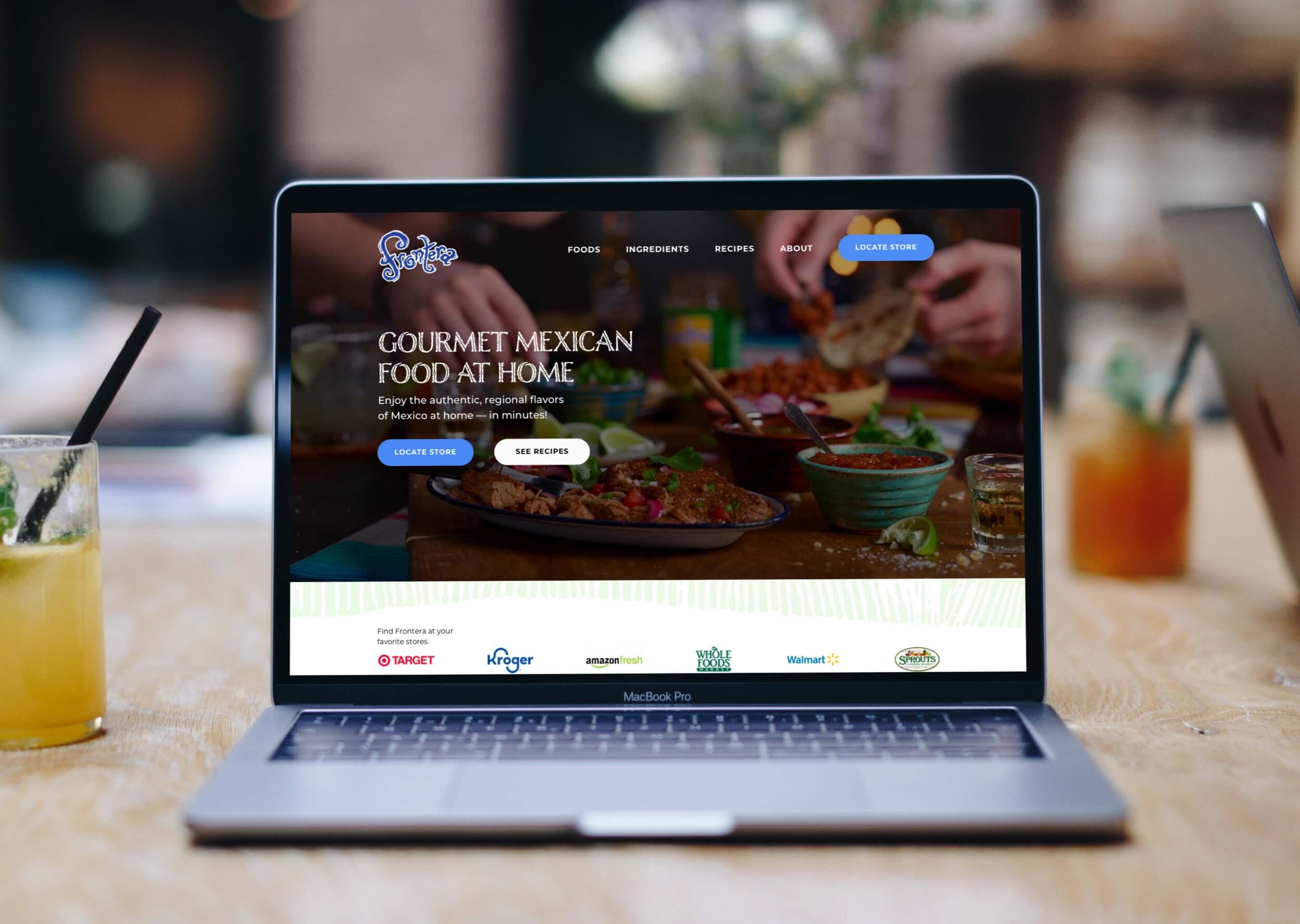
Increased the page width and height to create more white space around the content
Added an image that shows people eating Frontera products at home
Removed the SmartLabel link because it directs users to a third-party website (they may forget to come back). Instead, Frontera should add the SmartLabel link on product pages like Cascade does on their website.
Rewrote the navigation. I chose the "Foods" label instead of "Products" because it's more specific and correlates with the domain name –– fronterafoods.com
Replaced the H1 typeface with Nelson Engraved because I found its earthy style helps to form a brand identity that's grounded in tradition and authenticity. I also replaced the H3 typeface with Montserrat.
Wrote the headline and sub-headline to position Frontera as "Gourmet Mexican at Home"
Added primary and secondary CTAs with different colors, so they're distinguishable from one another
Section 2


What I did
Consolidated the inconsistent use of brand colors from Frontera's website and social media to create a more inviting, consistent and memorable brand identity
Replaced the H2 typeface with Nelson Engraved and replaced all other headings with Montserrat.
Added an ornament to evoke a Mexican pattern that also serves as a section divider since Frontera means "border" in Spanish
Added grocery store logos where Frontera products can be purchased
Added images of Frontera's product categories and used shadows to indicate clickable areas
Wrote the copy
Added a CTA
Section 3

What I did
Added a background color and several ornaments to evoke a Mexican motif that's on-brand
Added text boxes and images to communicate how Frontera creates gourmet Mexican food
Wrote the copy
Added CTAs
Section 4

What I did
Added images from Frontera's Instagram account to build community around gourmet Mexican food at home
Wrote the copy
Added CTAs
Section 5


What I did
Removed the Ready Set Eat link since it directs users to a third-party website that doesn't appear to be affiliated with Frontera
Added logos for Frontera and its parent company, Conagra
Added several footer links and grouped them under corresponding headings to improve the site's navigation
Added the copyright year, plus links to legal pages and underlined them since internet law requires these links to be obvious
Part 3: The Solution

I combined the 5 redesigned sections into a clean, compelling and user-focused solution that should, hypothetically, lead to increased sales at grocery stores.
Final Thoughts
By positioning Frontera as "Gourmet Mexican Food at Home" and creating a content strategy that supports that promise, Mexican cuisine lovers should now understand how the brand is different from the competition, so they're more likely to buy Frontera at the grocery store.