The New York Times: Upgrading the Podcast Directory

Unsolicited redesign of The New York Times’s podcast directory by Jeff Shibasaki
Part 1: The Challenge
Background
The New York Times produces some of the best podcasts from the best journalists in the world –– ranging from the long shadow of American slavery to the biggest stories of our time to book reviews and pop music. There's a podcast for every adult who enjoys learning, discussing, analyzing and exploring deep thoughts.
Problem

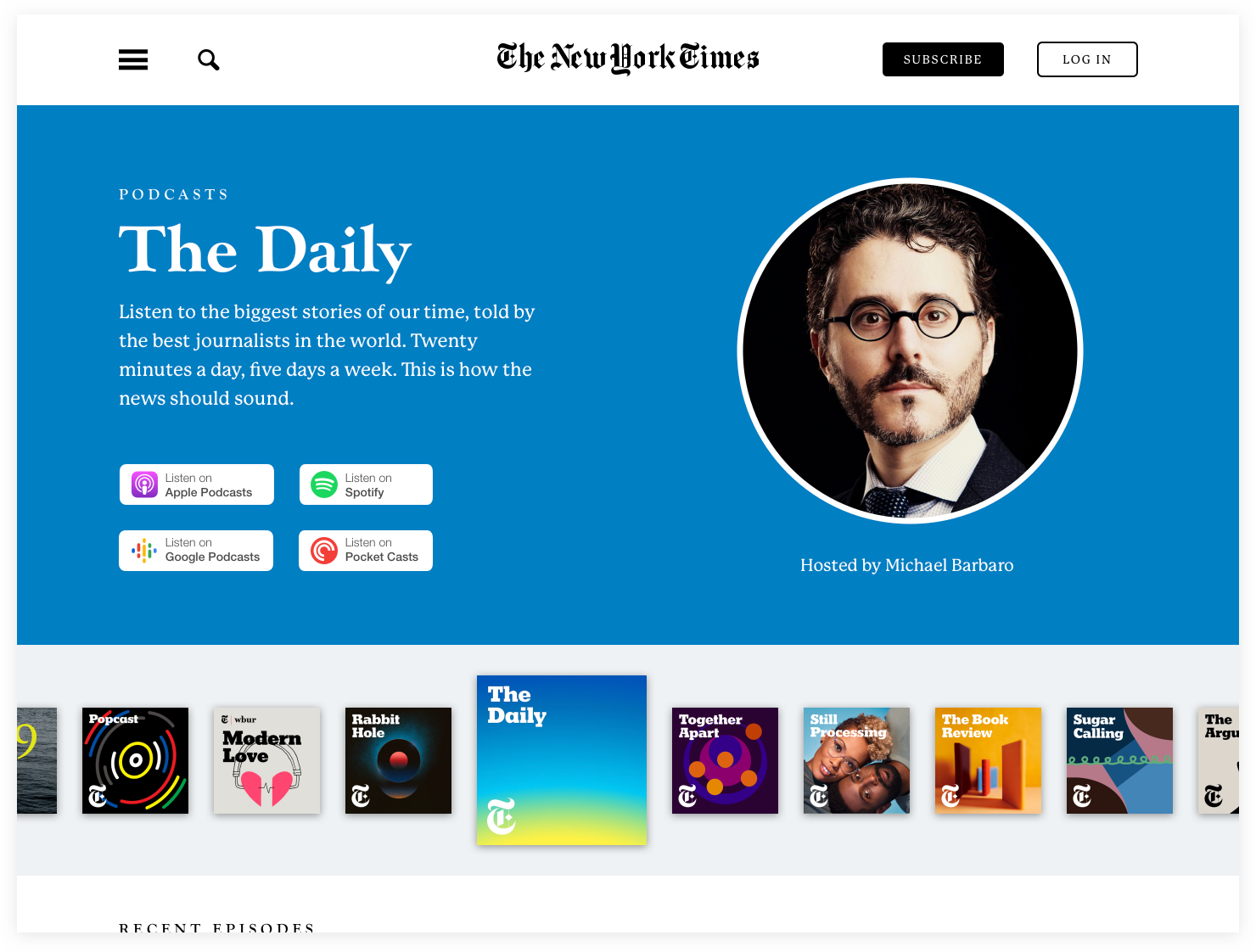
The Daily from The New York Times is one of my favorite podcasts. It's hosted by Michael Barbaro and includes some of the world's best journalists in a twenty-minute format, five days a week.
While I can find The Daily in the header of The New York Times's homepage when new episodes are released, discovering other shows in The NYT's podcast network is more difficult since there aren't any links from the homepage nor footer. If determined users do find the podcast directory, they're presented with an inefficient layout that's frustrating to use.
To improve the usability of The New York Times's podcast directory there needs to be a streamlined design that's easy to browse, discover and listen to podcasts.
Scope
I only redesigned The NYT's podcast directory header for this case study, not the rest of the page.
Roles
User research
Copywriting
Visual design
Interaction design
Tools
Paper
Markers
Miro
Sketch
Sip
WhatFont
Keynote
Copyright
Podcast directory logos are copyrights of Apple, Spotify, Google and Pocket Casts. All other photos included in my design are copyrights of The New York Times.
Part 2: The Process
Step 1: Empathize


I started listening to several NYT podcasts that I hadn’t heard before like 1619, Popcast and Still Processing. This helped me realize that the hosts needed to be part of the design. Not only did I want to connect the voices on these shows with their faces, but the hosts are often what makes a show great.
I looked at other podcast networks like NPR, Gimlet, Relay FM and TWit to study their layouts. While I didn’t like the crowdedness of TWiT’s directory, I found it easy to browse podcasts, subscribe and see the latest episodes –– all without having to click back and forth like the other podcast networks. Unlike TWiT’s directory, though, I wanted to create a dynamic header that would change when users clicked on the podcast artwork.
Step 2: Define
To create the design strategy, I made a list of pain points in Miro that I believed users like me have with the current design. For example, users have to click multiple times to learn about a podcast or listen to an episode and podcast artwork isn’t displayed to differentiate between shows.
Next, I inverted those pain points into goals, then created metrics for measuring my design’s success.
Step 3: Ideate

Before I could start sketching ideas, I needed to find all of the podcasts in The NYT’s catalog –– past and present. I used Apple Podcasts to find them, then created an alphabetical list. Knowing how many podcasts I had to work with and which ones were the most popular would help me organize the shows once I started the high-fidelity design.

After sketching initial ideas, I designed the wireframe in Sketch. To address several of the usability pain points, I focused on designing a dynamic header that changes when users click on a show’s podcast artwork. To browse shows, users can swipe the podcast artwork left or right.
I also made the currently selected podcast artwork larger to indicate its active state. This layout is more fun and helps users easily scan and recall shows. It also reduces clicks since users no longer have to click several times from the directory to easily browse shows.
To address pain points of small thumbnails and small font sizes, I made The NYT’s logo larger, fonts larger and increased padding. All of these fixes addressed pain points of small thumbnails and small font sizes.
Finally, in an undesigned section where the heading, Recent Episodes, is cut off, I imagined the latest episodes would include the show titles, descriptions, images and play buttons to stream from The NYT’s website.
Step 4: Prototype


Since The New York Times uses several proprietary typefaces (e.g. NYT Karnak, NYT Cheltenham, NYT Franklin) that I didn’t have access to, I chose similar typefaces that still look great. I used Goudy Old Style (Extra Bold) for the Heading 1 and P22 Mackinac Pro (Bold, Medium) for Headings 2 and 3 as well as captions.
When I started designing the high-fidelity concepts in Sketch, I changed The NYT’s primary CTA button, Subscribe, in the navigation bar to black, so it matches The NYT’s brand colors. I also made a ghost button for Log In to differentiate the secondary CTA.
In the header of the podcast directory, I rewrote the show descriptions to be more compelling and uniform in length. I also added headshots of each host and designed uniform Listen on badges for the most popular podcatchers. All of this addressed several pain points from the design strategy.
While I had already made the selected podcast artwork larger to indicate its active state in the wireframe, I decided to use each podcast’s artwork color as the directory’s dynamic background color. This would be another visual cue to inform users when they’ve selected a different podcast.
Part 3: The Solution
I created the final prototype in Keynote to convey interactions of the dynamic header. I chose to create a prototype because the static wireframes and visual designs didn’t fully communicate my design intent whereas the video prototype conveys the usability of my solution and its emotional impact. If this were a real project, ideally the prototype would validate the high-fidelity concepts to stakeholders before user-testing could begin.
Final Thoughts
As Michael Barbaro says at the end of The Daily podcast, “Here’s what else you need to no-tuh-day.” I set out to investigate redesigning The New York Times’s podcast directory because I thought the directory’s usability could be vastly improved. I believe I achieved this by creating a more efficient design that’s easy to browse, discover and listen to The NYT’s podcasts.