LinkedIn: Reimagining the iOS App (Game of Thrones Mash-Up)
Unsolicited redesign of LinkedIn’s iOS app by Jeff Shibasaki
Part 1: The Challenge
Background
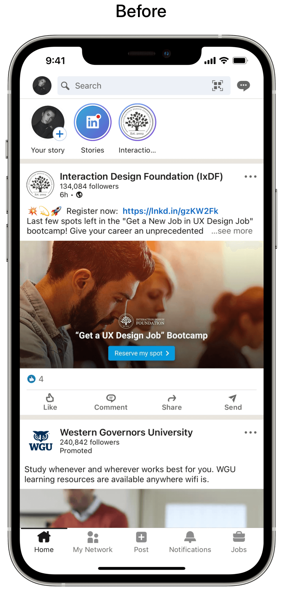
LinkedIn is a social network and job search board for professionals, companies and recruiters with 740 million registered members from 150 countries.
Problems
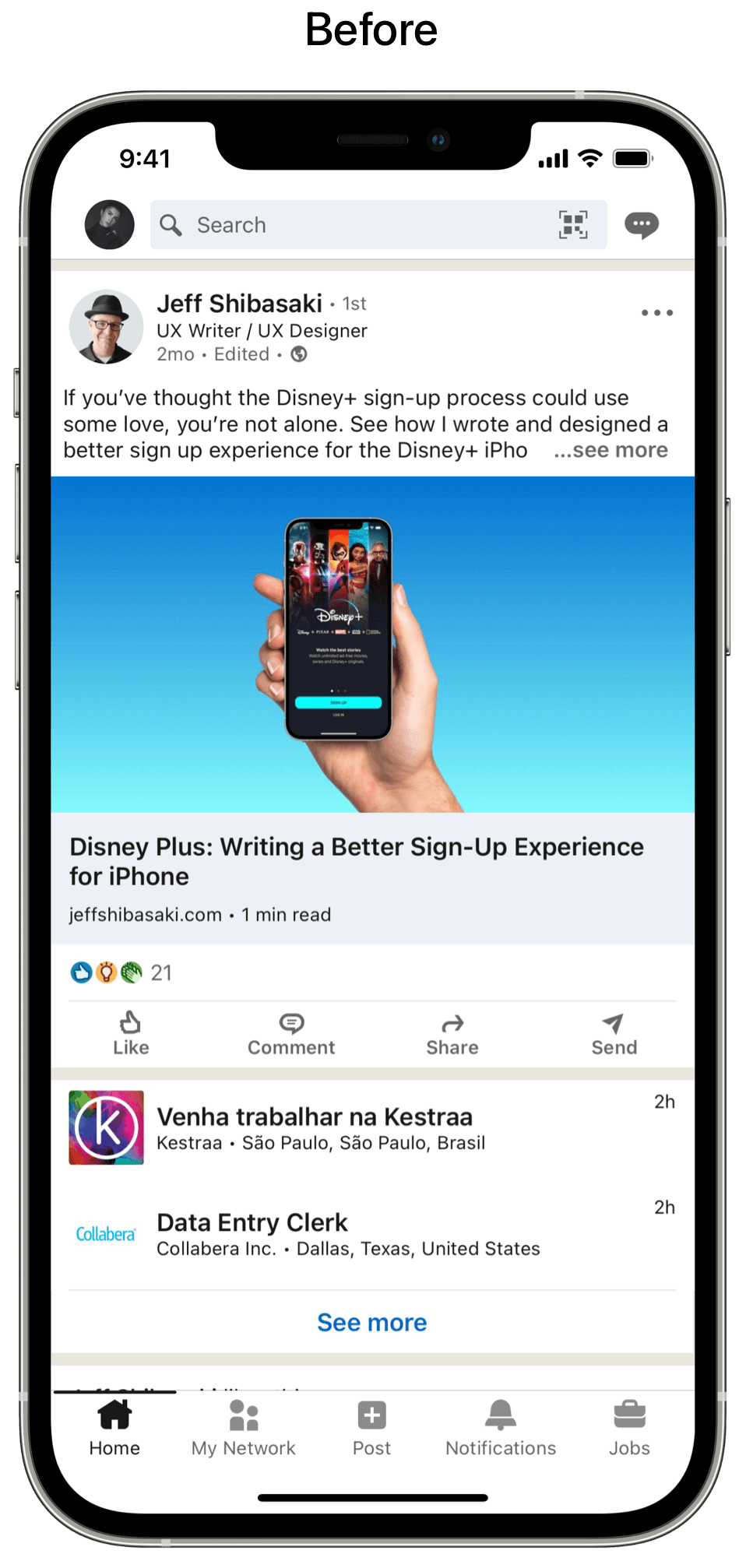
Users need a way to quickly check in with their network on iOS. Currently, they have to scroll through posts, recommendations, reactions, comments and more –– all without any indication if there are any new posts from the people, pages, groups and hashtags they care most about. If the Home tab doesn't provide a solution to easily sort and filter posts, it could lead to reduced user engagement.
Users also need a way to quickly access bookmarks, insights (e.g. profile views, post views, search appearances) and notifications on iOS. Currently, they have to navigate to their profile to view bookmarks, check insights and navigate around the app to clear notification badges from the My Network tab, Notifications tab and Messaging icon. If the bookmarks, insights and notifications can't be managed easier, it could cause friction with new users and lead to reduce engagement with current users.
Solutions
Provide multiple ways to sort and filter posts, so users can quickly check in with their network or jump into a filtered feed to interact with the posts that interest them
Combine expert curation on the check in screen to give users more personalization and LinkedIn a better way to promote their free services (e.g. Jobs, Events, Articles) and paid services (e.g. LinkedIn Learning, LinkedIn Premium). That helps both users and the business –– shared value.
Replace My Network with a Collections tab, so it’s easier to access bookmarks and filter recommendations to connect/follow
Combine notifications, messages and insights into a single screen with a segmented control to improve the app’s navigation and make clearing notifications, checking insights and messaging others easier and more fun
If this were a real project, I'd know my hypotheses and solutions to be true if the number of active devices, sessions and retention rates significantly increased.
Scope
Since I didn’t have access to user research, I relied on my own frustrations with the LinkedIn app to lead my decisions. While I could've designed several more LinkedIn Today sections (e.g. documents), plus an Account and Post Screen, I limited myself to the story I wanted to tell in the video prototype. I designed all of the screens for iPhone 12 Pro Max.
Roles
Information architecture
Interaction design
Content writing
UX writing
Visual design
Tools
Sketch
Pixelmator Pro
Keynote
Copyright
People in my designs are based on the characters from the book series, A Song of Ice and Fire by George R.R. Martin. Icons are from SF Symbols and the Noun Project. The LinkedIn logo is a copyright of LinkedIn. The Tower of Joy photo is from Wikipedia. All other photos (except the Wildfire app) are copyrights of HBO and WarnerMedia.
Part 2: The Process
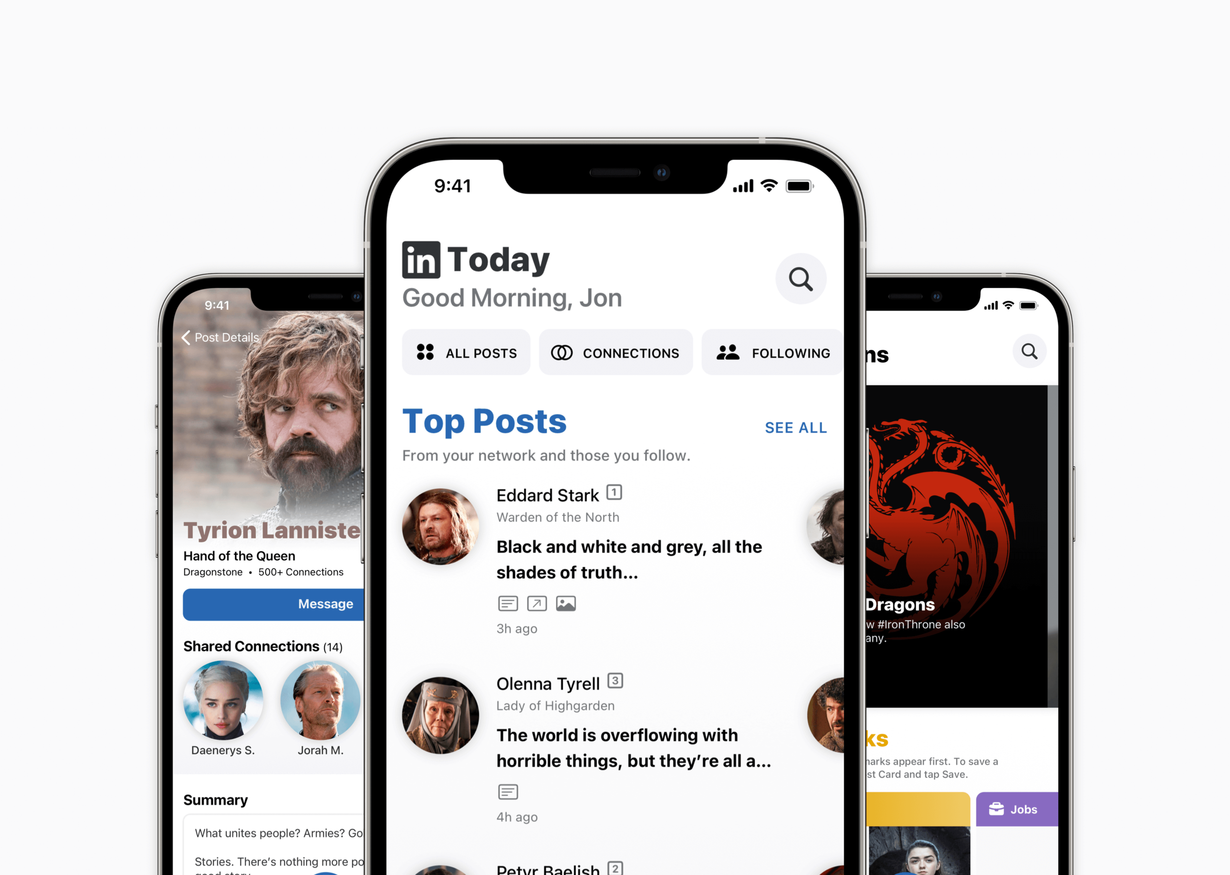
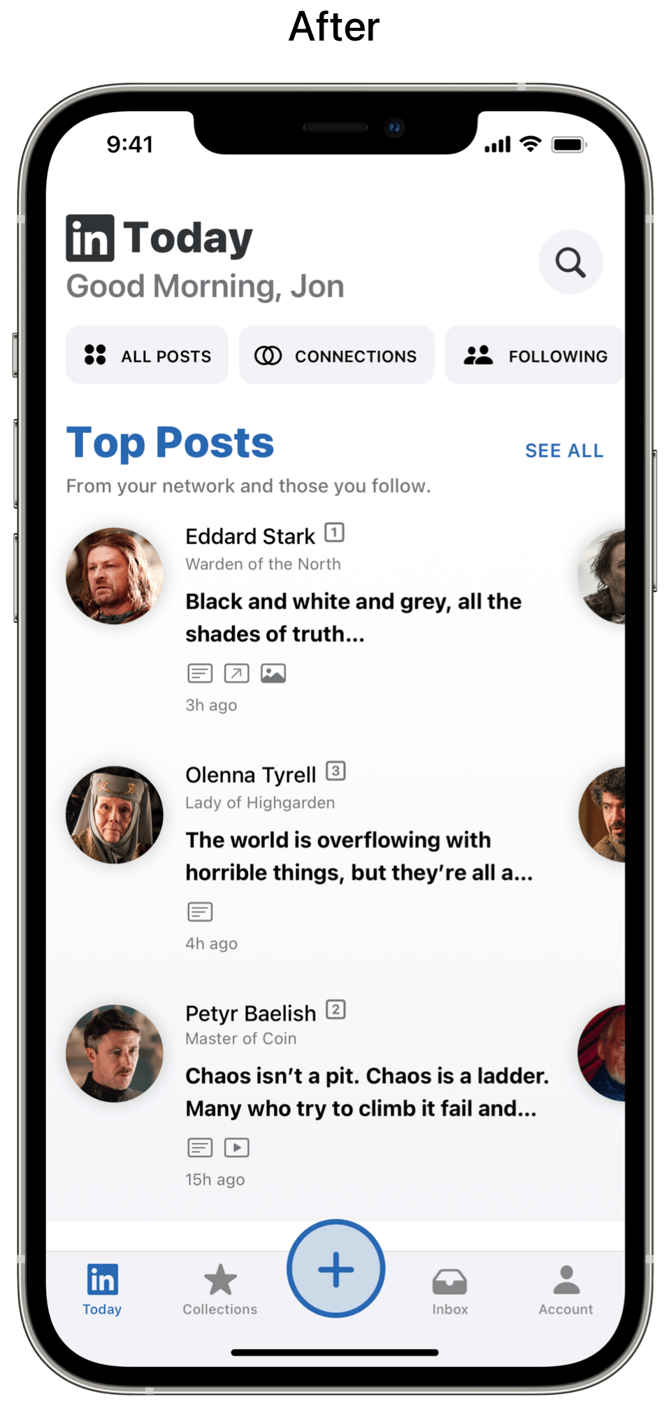
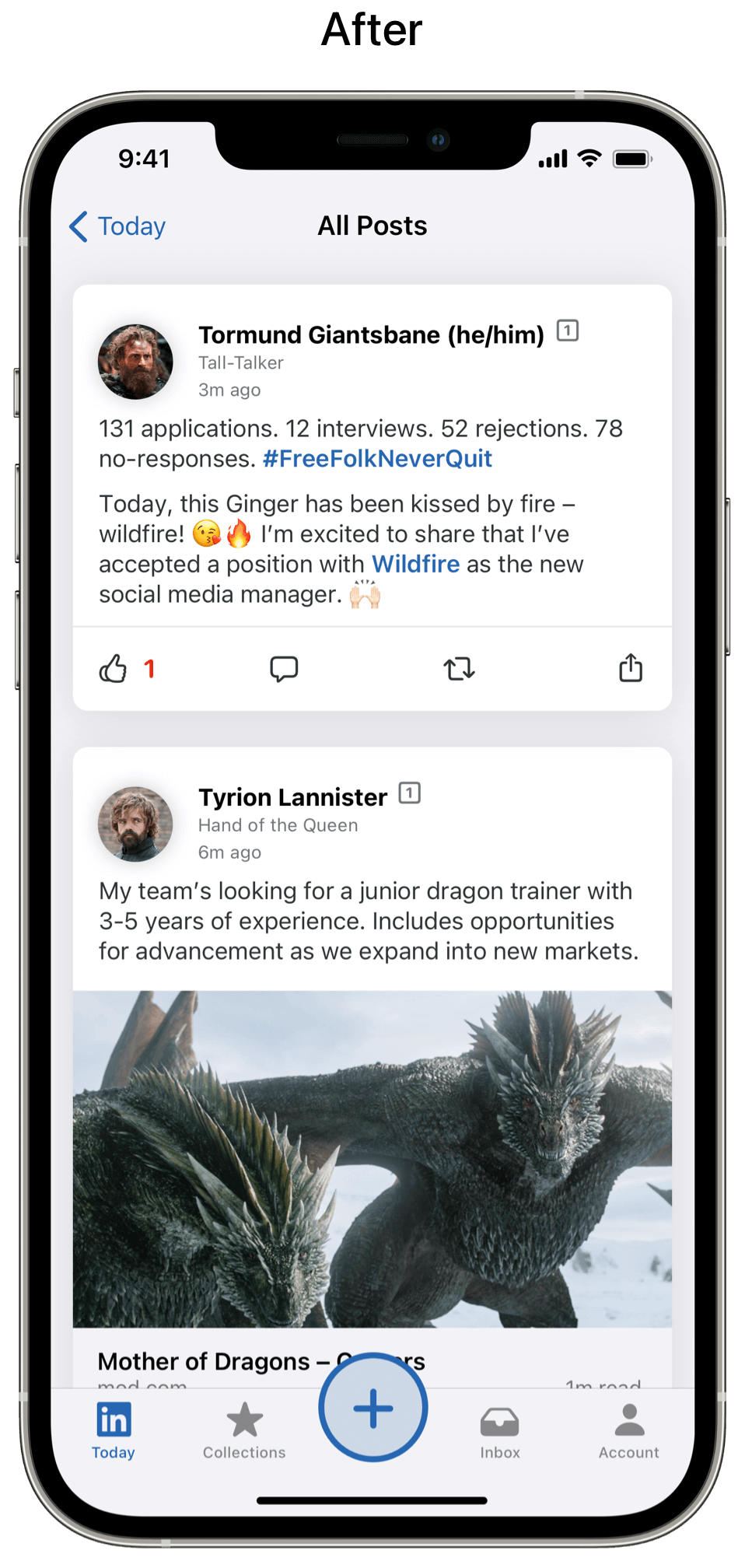
Screen 1: Home → LinkedIn Today
What I did
Designed and wrote 21 horizontal scrolling sections to help users sort and filter posts by update, post type or recommendation. To interact with posts (i.e. react, comment, share, save, etc.), users tap See All to enter the filtered feed.
Used characters from A Song of Ice and Fire (book series) and images from Game of Thrones (adapted TV series) to populate the content in my designs. I chose this fictional universe because there’s a large cast, nearly everyone has a title and most people are familiar with the books or TV series which makes the designs more fun than stock photos.
Followed LinkedIn’s brand colors to differentiate each section
Added icons from SF Symbols and the Noun Project on this screen and throughout the app to provide supplemental information and inform users what will/has happened
Used title case instead of sentence case on this screen and throughout the app to better differentiate interface elements
Created a style guide for terms found in the app –– LinkedIn Today, Collections, Inbox, Insights, Post Button, Post Card, Promoted Card, Comment Card, Connect Card, Follow Card, Notification Card, Bookmarks, Professional Profile, Company Profile, Group Profile, etc.
Renamed Pages to Company Profile to standardize the naming convention of LinkedIn landing pages
Made all profile photos round to unify the interface
Added controls to sort posts by All Posts, Connections, Following, Groups, Companies, Hashtags, Contacts, Teammates and Newsletters
Added a search button. When users tap the button, the search page slides in from the right. When scrolling the page, the search button transforms into a search bar. You can see this in the LinkedIn Today sections below.
Wrote microcopy to inform users how post types and recommendations are selected
Limited post previews to 2 lines and used an ellipsis to indicate when there’s more text
Redesigned the tab bar to be more useful and encourage sharing with the Post Button. While this raised center button is more complicated to develop, it helps to further distinguish LinkedIn from other apps.
Renamed the Home tab to LinkedIn Today since Home isn’t specific (I know lots of apps do this, but that doesn’t make it right) and since LinkedIn confusingly calls this Home, Homepage and Feed in their knowledge base and other places. I also removed Jobs since they’re curated on LinkedIn Today in my designs, can be searched and filtered in the Search Bar, plus saved jobs appear on the Collections tab. See Screen 5 for why I changed My Network and Screen 7 for why I changed Notifications.
LinkedIn Today: Sections 1–3
What I did
Designed and wrote a Top Posts section, so users can quickly browse the most popular posts from their network or tap See All to enter the filtered feed
Designed and wrote an Updates section, so users can quickly browse updates or tap See All to enter the filtered feed
Designed and wrote a Videos section, so users can quickly browse posts with videos or tap See All to enter the filtered feed
LinkedIn Today: Sections 4–6
What I did
Designed and wrote Promoted sections with a CTA button to differentiate promoted buttons (black) from primary buttons (blue) and secondary buttons (white). There are four promoted sections on LinkedIn Today and five in my solution.
Designed and wrote a Collections section, so users can quickly browse saved bookmarks or connect and follow people, companies, hashtags and groups. Tapping one of these cards opens their corresponding section and tapping See All opens all of them.
Designed and wrote a Photos section, so users can quickly browse posts with photos or tap See All to enter the filtered feed
LinkedIn Today: Sections 7–9
What I did
Designed and wrote a Text section, so users can quickly browse text-only posts or tap See All to enter the filtered feed
Designed and wrote a Links section, so users can quickly browse posts with links or tap See All to enter the filtered feed
Designed and wrote a Polls section, so users can quickly browse posts with polls or tap See All to enter the filtered feed. Also, I imagined LinkedIn adding Unsplash support to make polls more engaging with free images instead of just buttons.
LinkedIn Today: Sections 10–12
What I did
Designed and wrote a News section, so users can quickly browse recommended news and conversations from LinkedIn News or tap See All to view in a list.
Designed and wrote a Connect vs. Follow section to support new users and remind current users of the difference between connecting and following on LinkedIn since people are often confused. Tapping any of these cards brings users to a short explainer video.
Designed and wrote a Courses section, so users can quickly browse recommended LinkedIn Learning courses or tap See All to view in a list
LinkedIn Today: Sections 13–15
What I did
Designed and wrote an Events section, so users can quickly browse recommended events or tap See All to view in a list
Designed and wrote a Jobs section, so users can quickly browse recommended jobs or tap See All to view in a list
Designed and wrote a Profile section to support new users and remind current users how to complete their profile and reach All-Star status. Tapping any of these cards brings users to a short explainer video.
LinkedIn Today: Sections 16–18
What I did
Designed and wrote an #IronThrone section, so users can quickly browse posts with this hashtag or tap See All to enter the filtered feed
Designed and wrote a Featured section, so users can easily discover new people, companies and courses, plus try to get featured by improving their Profile with an All-Star status
Designed and wrote a Reactions section (e.g. like, celebrate, support, love, insightful, curious), so users can quickly browse posts with reactions or tap See All to enter the filtered feed
LinkedIn Today: Sections 19–21
What I did
Designed and wrote a Comments section, so users can quickly browse posts with comments or tap See All to enter the filtered feed
Designed and wrote an Activity section, so users can quickly find or review their LinkedIn activity or tap See All to view in a list
Designed and wrote a LinkedIn Premium section, so users can easily understand the benefits of LinkedIn’s paid services. Tapping each of these cards brings users to their respective in-app landing page.
Screen 2: Home → All Posts
What I did
Added a back button and label since this screen’s been accessed from LinkedIn Today
Designed and wrote Post Cards that use standard iOS iconography. Also, instead of the three-dot menu, users can left-swipe the cards for additional options just like the Promoted Post on LinkedIn Today above.
Designed and wrote a Promoted section that’s consistent with other promoted sections on LinkedIn Today
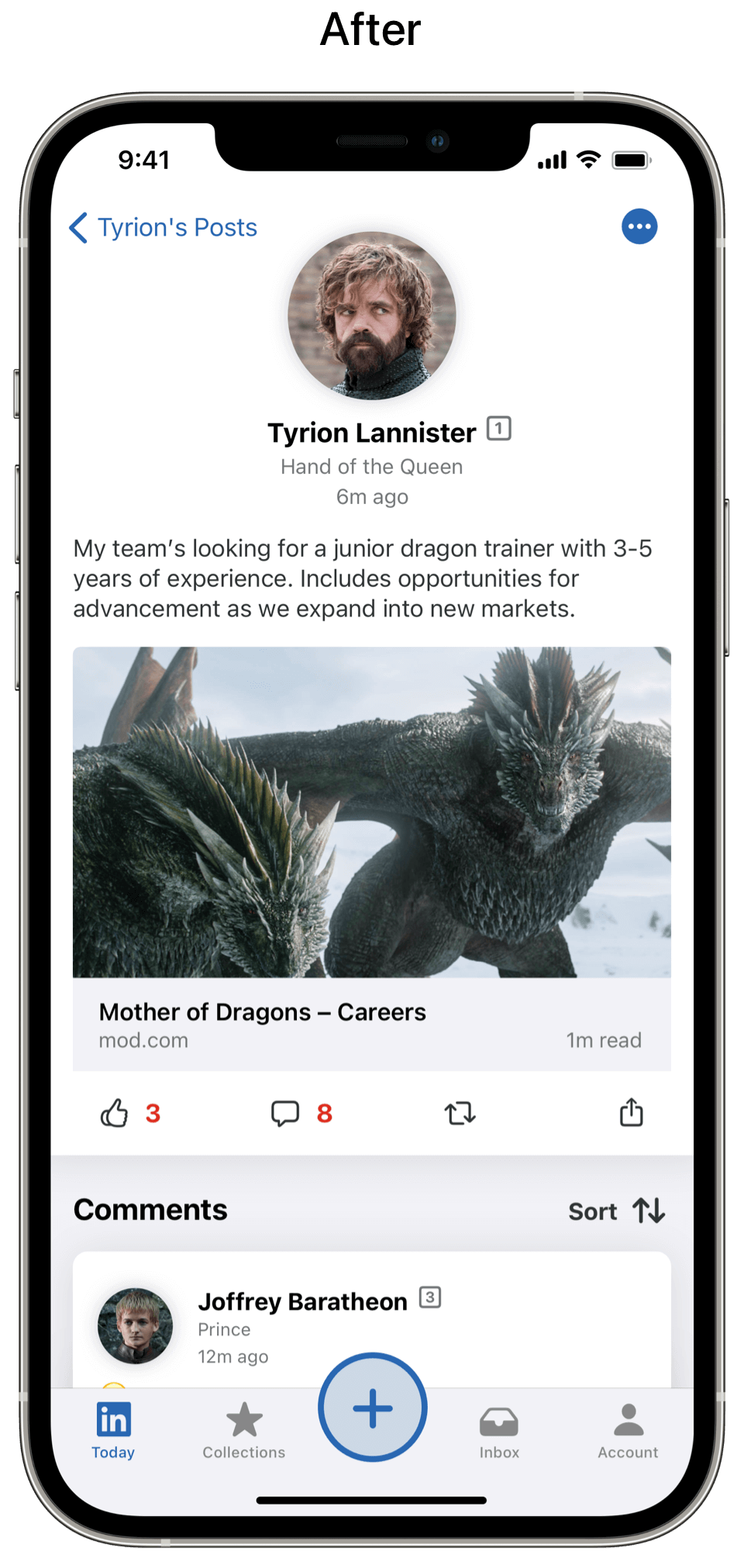
Screen 3: Post Details
What I did
Added a back button and label since this screen’s been accessed from Tyrion’s Posts
Made the profile photo and details larger and centered them to differentiate this page from a list of posts in a feed
Added a sort button and label to sort by time or relevancy
Designed and wrote Comment Cards. To indicate a thread of comments, I stacked the cards. Tapping the top card expands the thread.
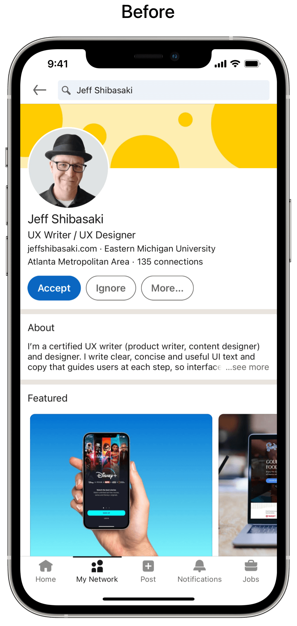
Screen 4: Profile (Viewing a Connection)
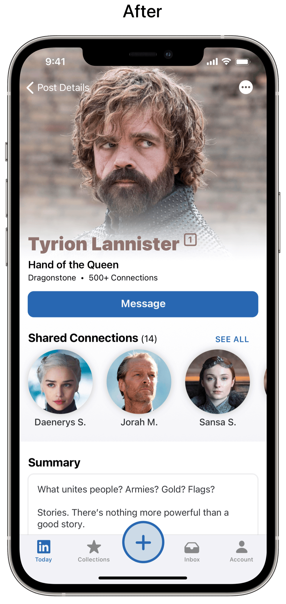
What I did
Added a back button and label since this screen’s been accessed from Tyrion’s Post Details
Expanded the photo to create a more visually appealing Profile with a better hierarchy to improve readability. I also added color from the profile photo’s background to further personalize the page.
Added a three-dot menu for additional options since the Profile isn’t a card that can be swiped like Post Cards
Added a button to message the connection
Added a shared list of connections and a Summary section with text boxes
Screen 5: My Network → Collections
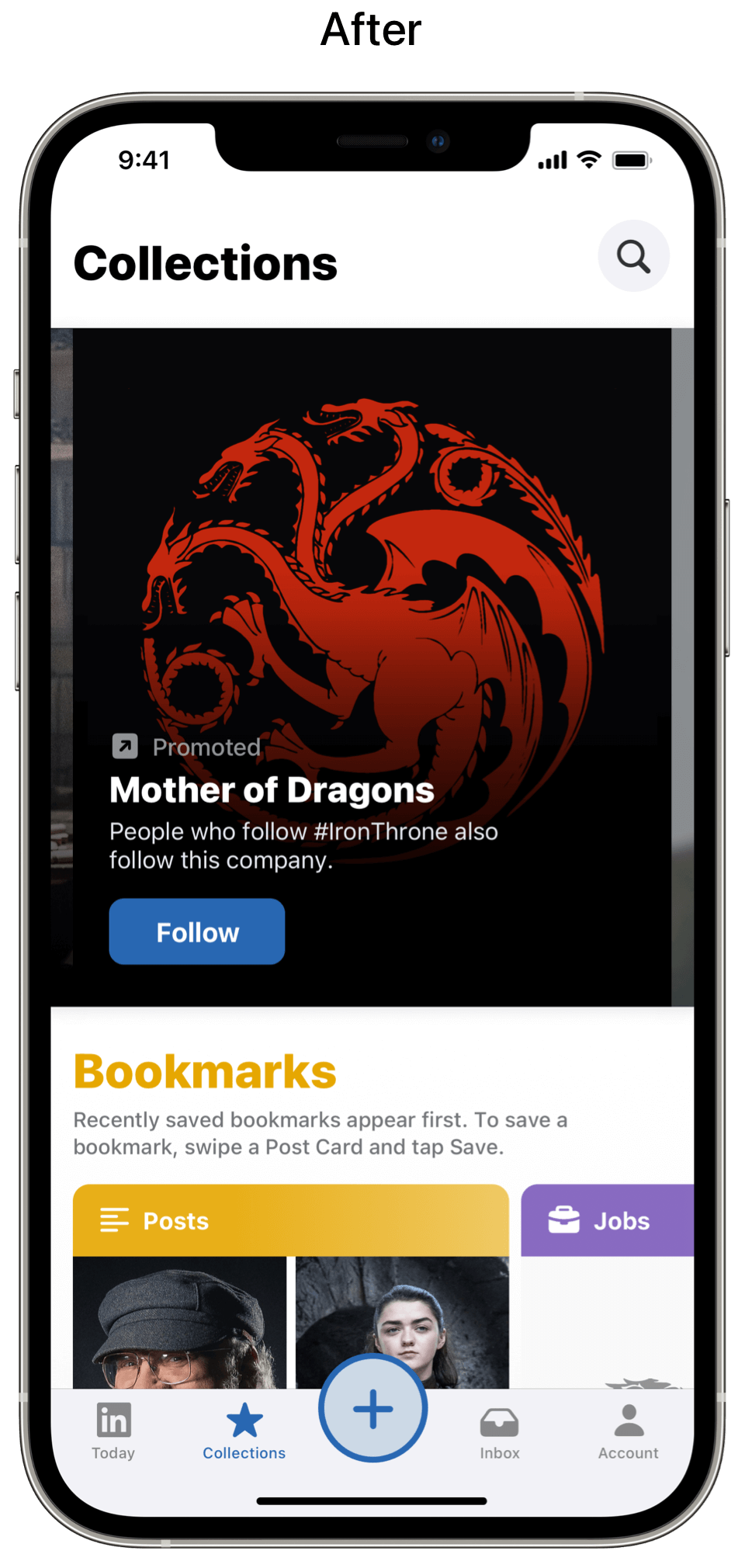
What I did
Designed and wrote a horizontal scrolling header to recommend people, companies and groups to follow. Not only does this help users discover more recommendations, but it’s also a new location to add promoted and non-promoted recommendations.
Designed and wrote 3 sections (Bookmarks, Who to Connect with, Who to Follow). There could be more collections, but I limited myself to these essentials.
Added a search button. When users tap the button, the search page slides in from the right. When scrolling the page, the search button transforms into a search bar. You can see this in the Collections below.
Renamed My Network in the tab bar to Collections since a user’s network is made up of their 1st-degree, 2nd-degree and 3rd-degree connections, plus members of groups –– not pages, hashtags, events and recommendations.
Collections: Sections 1–3

What I did
Designed and wrote a Bookmarks section, so users can easily access saved bookmarks. I also renamed My Items to Bookmarks because it’s more specific and doesn’t sound like things in an online shopping cart.
Designed and wrote a Who to Connect with section, so users can easily browse recommendations
Designed and wrote a Who to Follow section, so users can easily browse recommendations
Screen 6: My Network (Section) → People from Your Area

What I did
Added a back button and label since this screen’s been accessed from Collections
Added an orange header that corresponds to the People from Your Area collection to remind users what they tapped and who they’re connecting with
Added a search button. When users tap the button, the search page slides in from the right. When scrolling the page, the search button transforms into a search bar.
Designed Connect Cards with profile photos and buttons
Wrote a confirmation message to inform users when a Connection Request has been sent and where they can find accepted requests (see part 3 to view this in action)
Screen 7: Notifications → Inbox
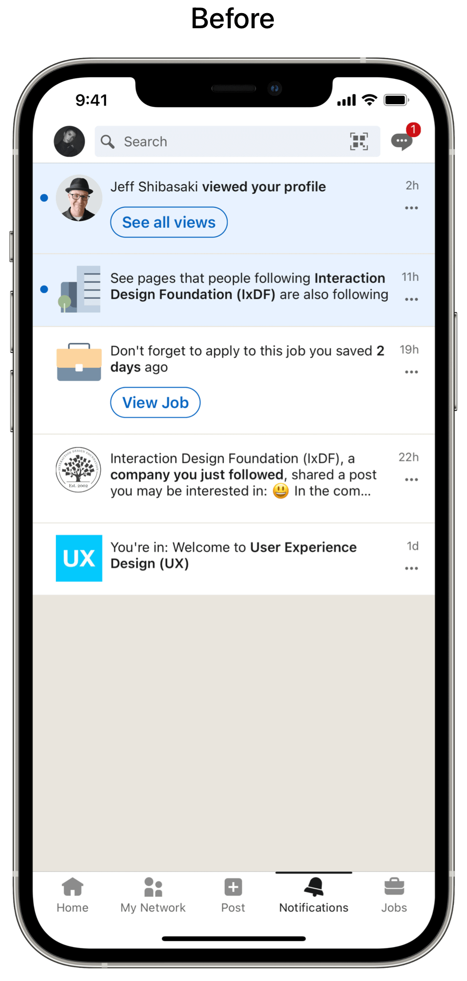

What I did
Renamed Notifications in the tab bar to Inbox
Renamed Messaging to Messages
Renamed Your Dashboard to Insights
Added a segmented control for Notifications, Messages and Insights to create a unified inbox where all incoming information can be easily accessed.
Designed Notification Cards to be similar to Post Cards except they all have buttons that inform users what to do next
Added buttons under Notification Cards for additional options. Notification Cards can also be quickly left-swiped to delete.
Screen 8: Profile (Viewing a Connection Request)
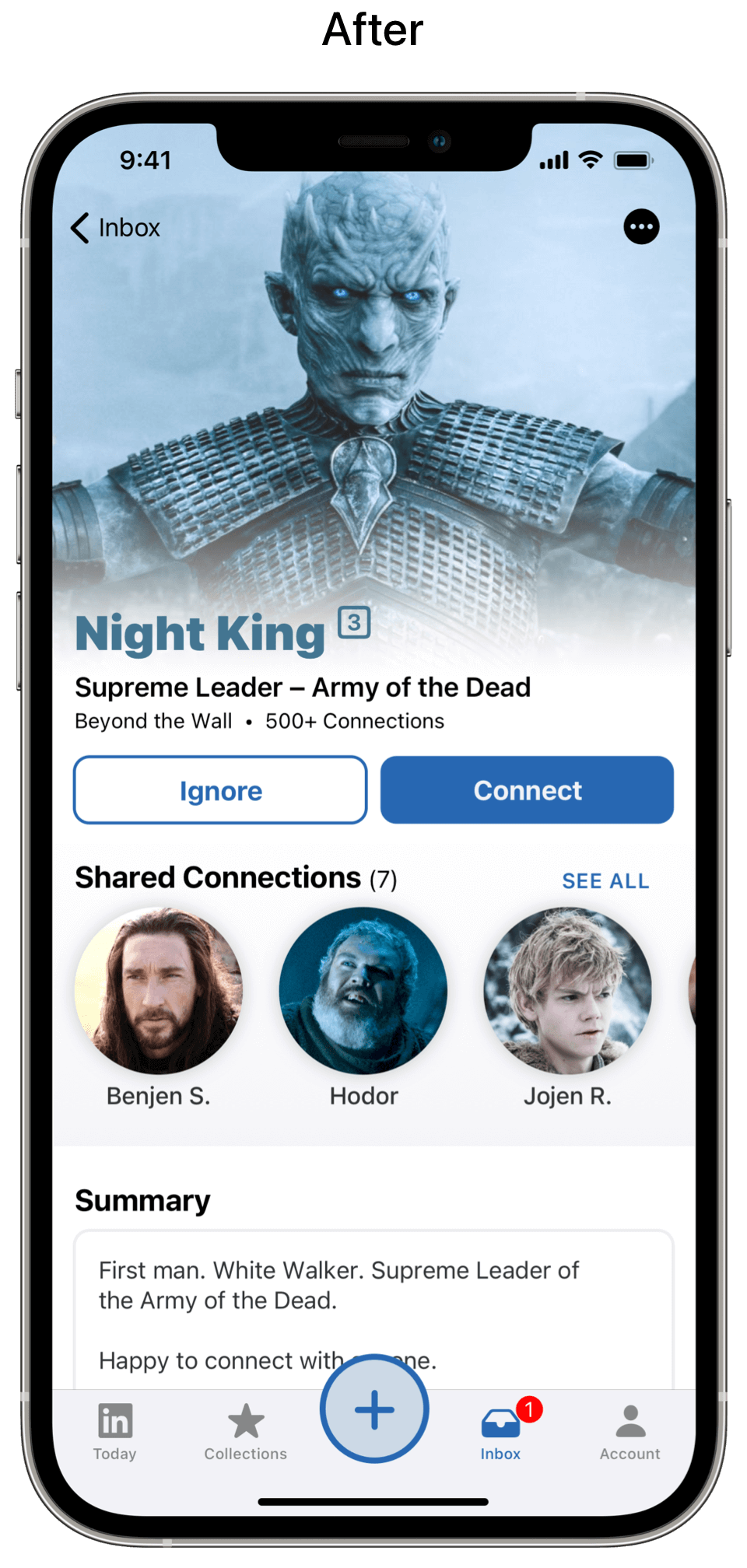
What I did
Added a back button and label since this screen’s been accessed from the Inbox
Expanded the photo to create a more visually appealing Profile with a better hierarchy to improve readability. I also added color from the profile photo’s background to further personalize the page.
Added a three-dot menu for additional options since the Profile isn’t a card that can be swiped like Post Cards
Added buttons to Connect or Ignore. I put connect on the right since most people are right-handed which makes it easier to accept a connection request. Also, I changed the button text from Accept to Connect because it clearly informs users what they’re accepting –– a new connection.
Screen 9: Messaging → Messages
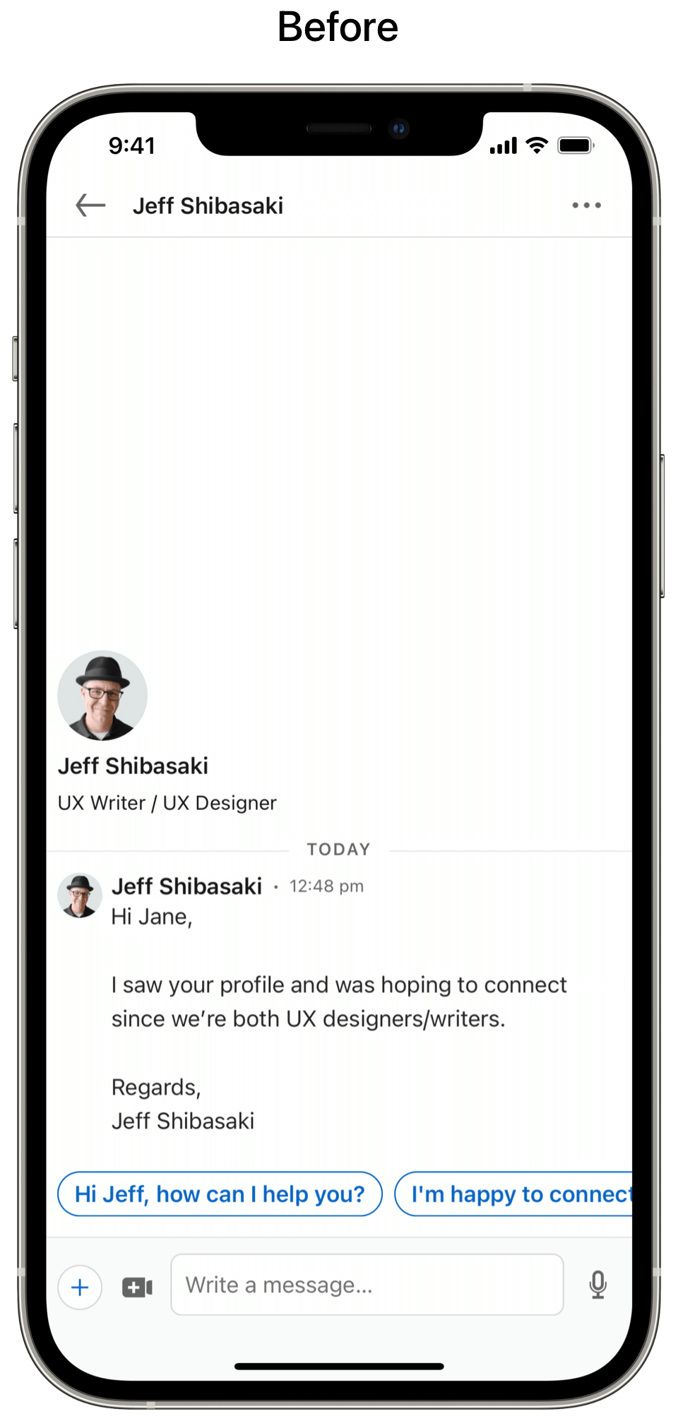

What I did
Added a back button and label since this screen’s been accessed from the Inbox
Added a three-dot menu for additional options
Enlarged the profile photo of the person the user is messaging at the top of the screen. When the user scrolls or begins to write a message, the size is reduced
Added the message that Tyrion sends to Jon Snow via a raven on Game of Thrones (season 7, episode 2) with a timestamp
Added a large field to compose messages and wrote hint text
Added a pencil icon to show LinkedIn’s Smart Replies. If the user doesn’t select a Smart Reply and starts writing a message, the pencil icon transforms into a blue send button
Added icons to quickly start meetings, select photos, open the camera, attach a document or mention someone. All of these icons inform users how they can start a message. Once the user begins typing, these options are then tucked behind a chevron (see Part 3 to view this in action).
Part 3: The Solution
I combined all of the LinkedIn Today sections and subsequent screens into a video prototype to illustrate how users can quickly check in to see what's happening in their network, get more personalized recommendations, easily access bookmarks, clear notifications and respond to messages.
Final Thoughts
By giving users multiple ways to sort and filter posts, plus making the app more helpful with expert curation, more intuitive with a navigation overhaul and more attractive with a modern visual design all improves the app’s look, feel and usability. It's time to redesign the LinkedIn app.


