Disney Plus: Writing a Better Sign-Up Experience for iPhone

Unsolicited redesign of Disney Plus’ sign-up process by Jeff Shibasaki
Part 1: The Challenge
Background
Disney+ is the on-demand, subscription streaming service that's home to movies, series and originals from Disney, Pixar, Marvel, Star Wars and National Geographic.
Problem
Users need a way to sign up to Disney+ that’s more benefit-driven and helpful at each step. If the sign-up process isn’t clear, concise and useful, it could cause friction and result in drop-off.
Solution
I believe that communicating exactly what users need to know –– no more, no less –– will improve the sign-up experience.
If this were a real project, I’d know my hypothesis and solution to be true if the drop-off rate reduced and the number of subscribers increased.
Scope
While I did the entire redesign myself, I've only detailed my process for writing the UI text. Mockups were created for iPhone 12 Pro Max.
Roles
UX writing
Interaction design
Visual design
Tools
Sketch
Pixelmator Pro
Keynote
Copyright
Photos included in my design are copyrights of Disney.
Part 2: The Process
Screen 1


What I did
Wrote a short, benefit-driven tagline and description of Disney+
Wrote and designed carousel screens to communicate the benefits of Disney+ with as few words as possible (see Part 3 to view this in action)
Added an aqua button for the primary CTAs since it’s the main color in the Disney+ logo and stands out better on dark backgrounds
Added the secondary CTA below the button. To improve recognition on all screens, I placed all secondary CTAs throughout the sign-up process in the same location and made them the same color and size.
Screen 2


What I did
Added a back button and label that’s consistent with iOS’ design to create a more familiar and comfortable interface during sign up
Added the Disney+ logo and email label, so users remember what they’re signing up for and what they need to enter
Simplified the button text
Edited legal text to be more concise since Apple’s Human Interface Guidelines recommend not showing in-app licensing agreements and disclaimers
Screen 3
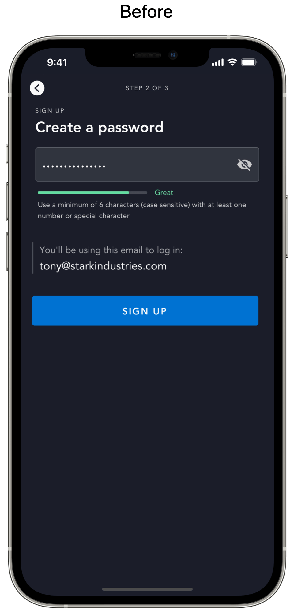

What I did
Added a back button and label that’s consistent with iOS’ design to create a more familiar and comfortable interface during sign up
Added the Disney+ logo and password label, so users remember what they’re signing up for and what they need to enter
Edited microcopy to be more efficient
Wrote button text to indicate what happens next
Screen 4


What I did
Wrote instruction text
Wrote plan details. The payment information is outlined in the Apple Pay pop-up screen that appears when tapping the button (see Part 3 to view this in action).
Wrote button text
Screen 5
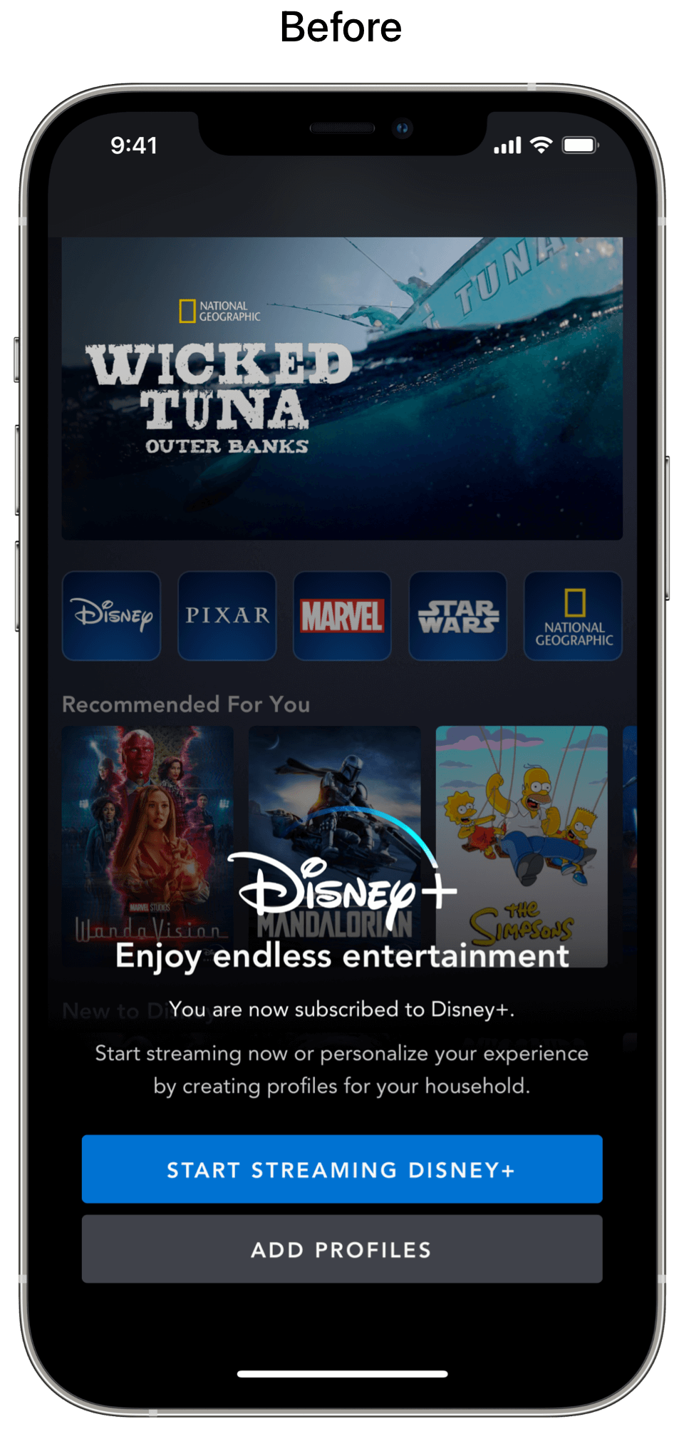

What I did
Reintroduced the tagline that I created on the first screen to welcome users to the best stories
Added glyphs from Apple’s SF Symbols that appear on the home screen tab bar (screen 6)
Wrote benefits to introduce the home screen tab bar
Wrote text for the primary CTA and secondary CTA
Screen 6


What I did
Added SF Symbols to the tab bar because these glyphs seamlessly integrate with the San Francisco font to convey a unified design language
Wrote labels to provide additional context since glyphs without labels are often misunderstood and cause friction
Part 3: The Solution
I combined all of the above screens into a video prototype to illustrate the improved sign-up flow in action. Though not detailed herein, the UI copy also provided direction for the interaction and visual design.
Final Thoughts
Since the sign-up screens are the first interaction users have with the Disney+ app, choosing the right words is critical to reducing drop-off. By starting with benefits and reducing friction on every screen with clear, concise and useful words, users are presented with a better sign-up experience.


